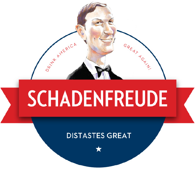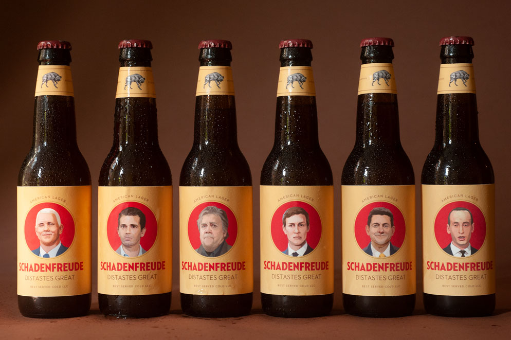
SCHADENFREUDE AMERICAN LAGER
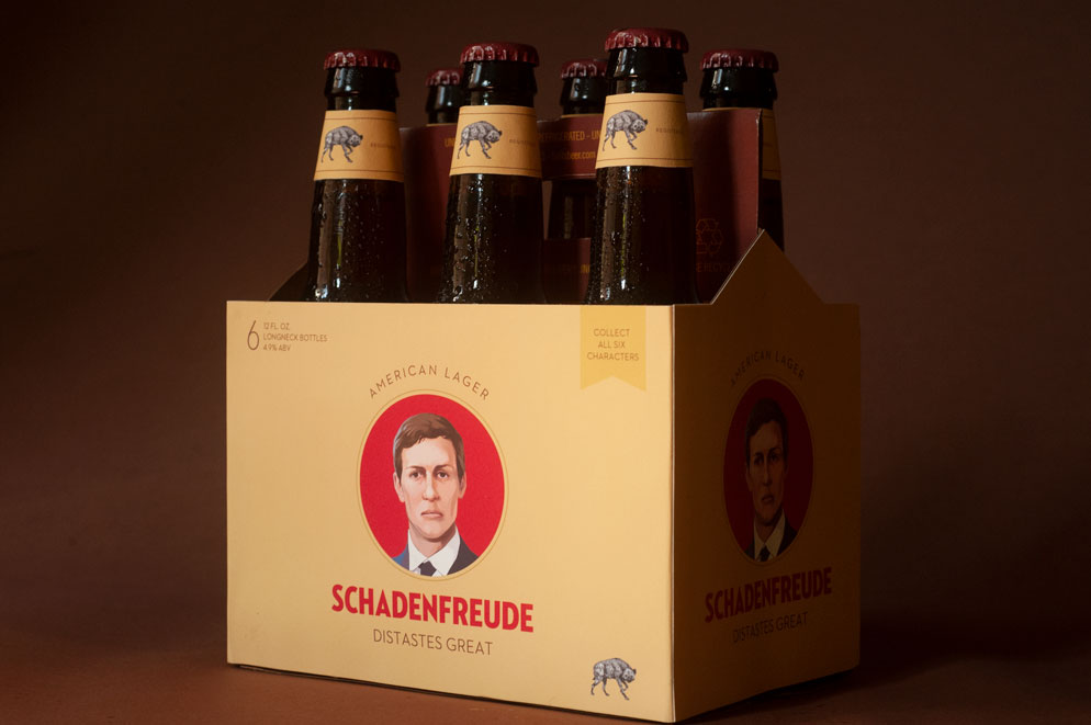
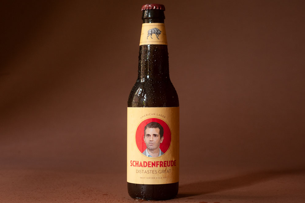
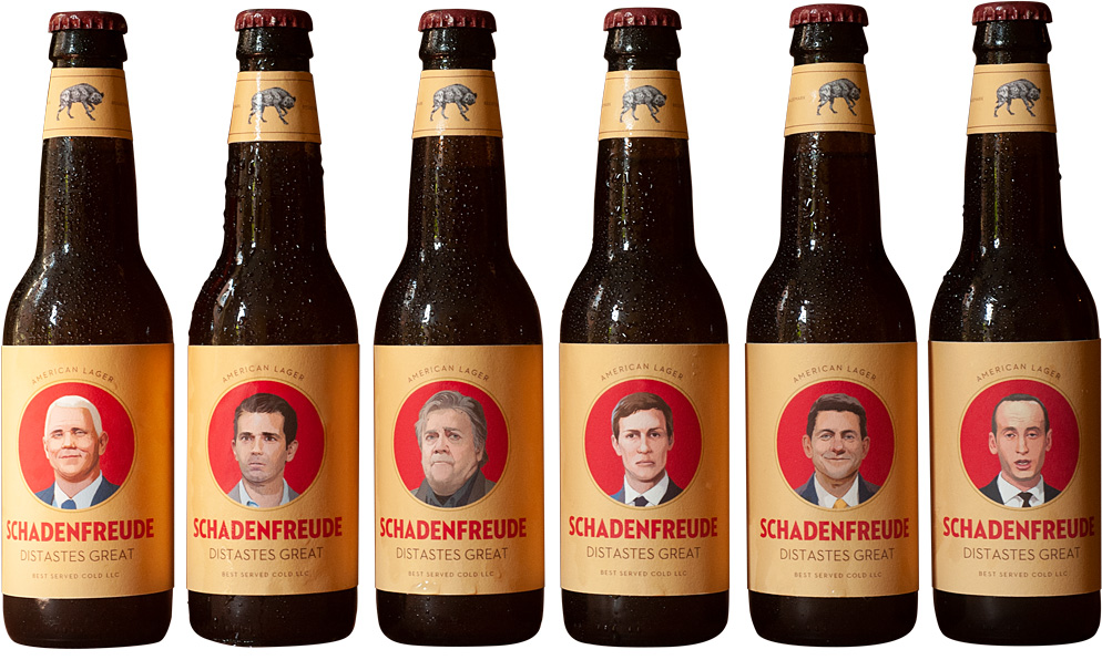
When the folks at Best Served Cold wanted to promote the launch of their tongue in cheek political news site, they teamed up with a local brewer to create Schadenfreude American Lager. I created the packaging, posters, coasters and giveaways.
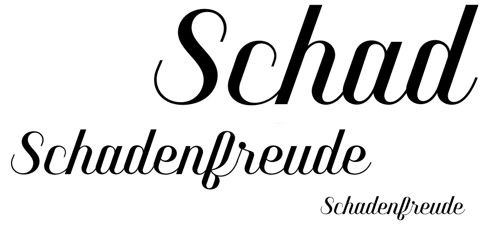
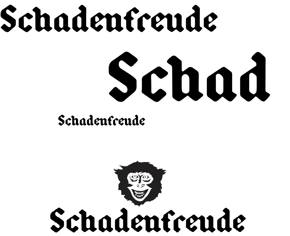
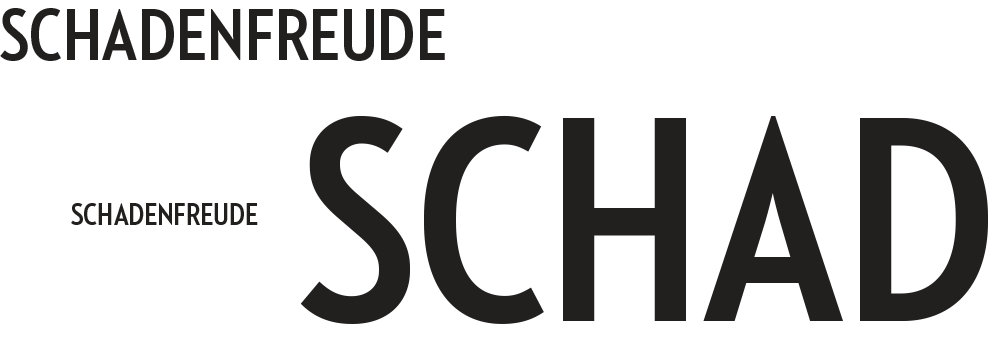
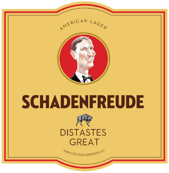
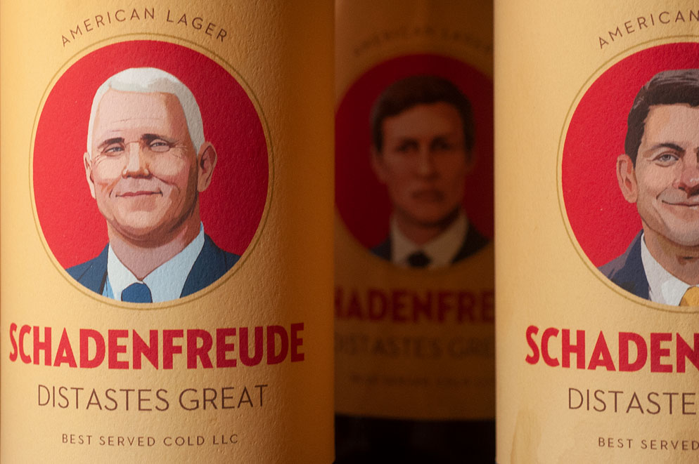
The brief called for “a product that looks like it’s been on the shelves since the golden age,” so I began with a typographic exploration of cuts originating from the turn of the century through the 1950s.
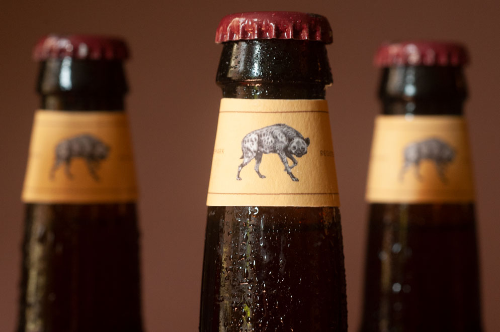
Once we identified typographic directions we explored color palettes and retaining shapes associated with classic beer brands.
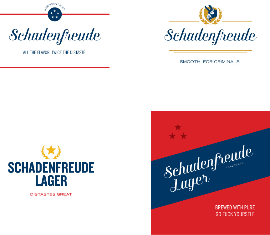
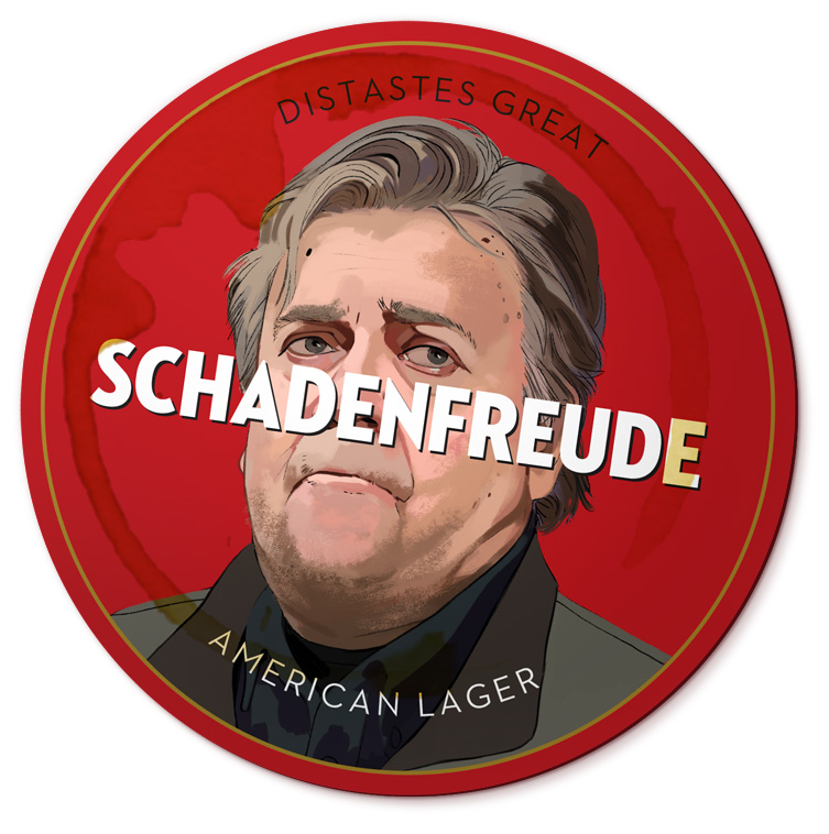
We planned on using illustrations of some of the culprits of the current political climate on promotional materials. We began incorporating the illustrations into the logotypes and determined they should be a primary element of the packaging.